bold reuse: Designing for sustainability
In the bustling Pacific Northwest cities of Portland and Seattle, where the spirit of sustainability permeates every aspect of life, a groundbreaking company is making waves in the food industry. Bold Reuse, a full-service reusable platform, is revolutionizing the way businesses approach packaging, seamlessly transitioning them from the environmentally harmful world of disposables to a more sustainable future.
As a designer fortunate enough to work on the creation of Bold Reuse's brand identity, logo, pitch decks, web icons, and brand style guide, it's been an inspiring journey to contribute to a project that aligns so closely with my personal values. The mission was clear: create a visual identity that communicates the essence of Bold Reuse – a company that champions eco-friendly practices in the food industry.
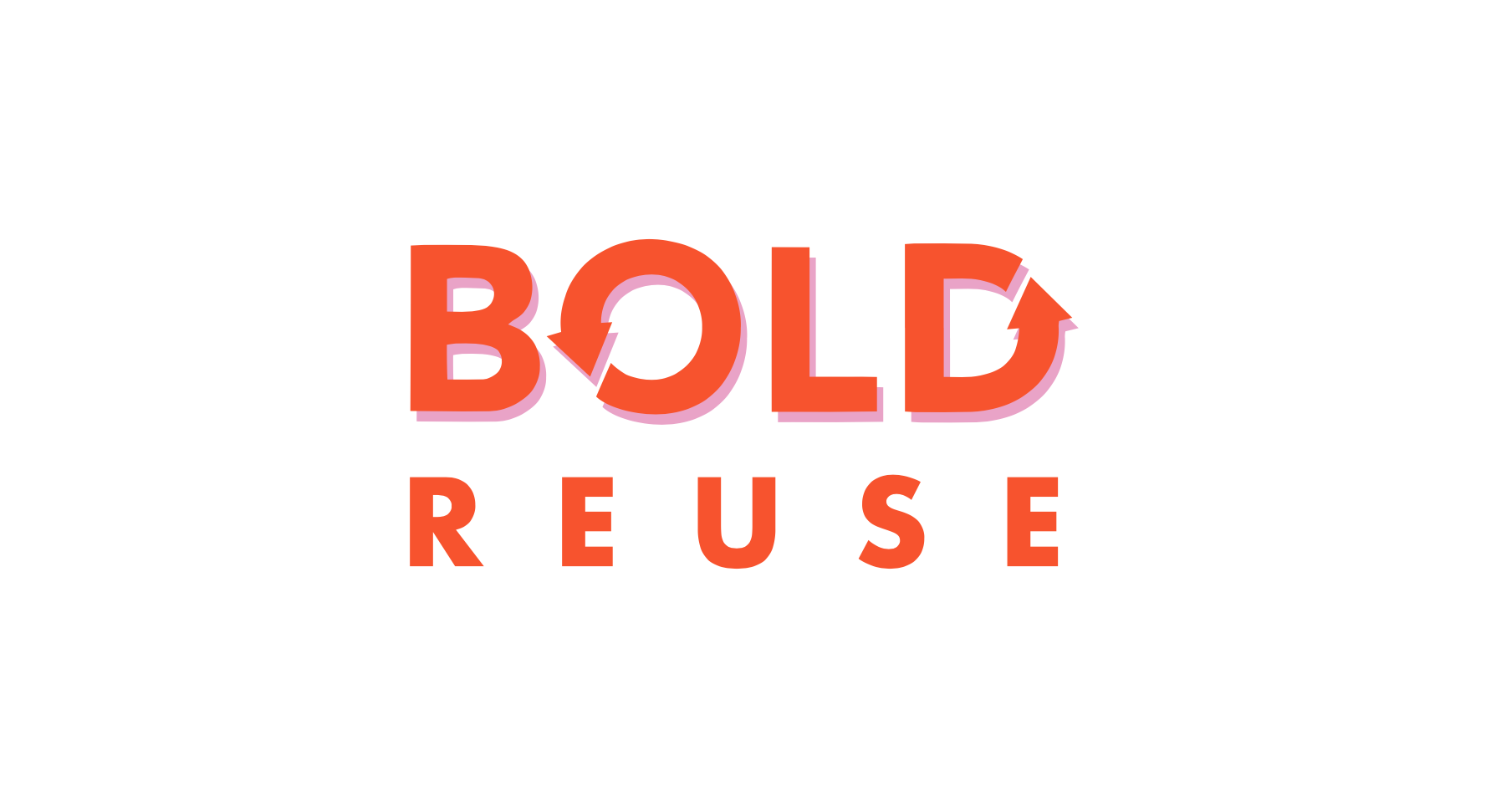
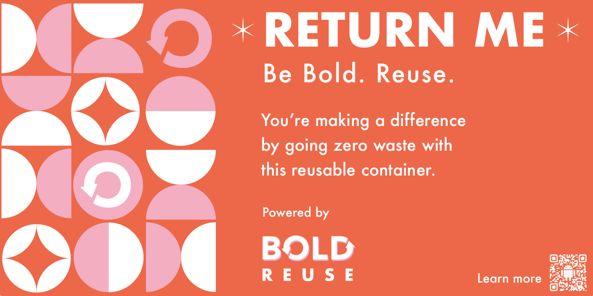
The Logo: The logo design encapsulates the essence of Bold Reuse. A bold, interconnected loop symbolizes the cyclical nature of reusability. It's not just a design; it's a representation of a closed-loop system that minimizes waste and contributes to a healthier planet. The color palette, inspired by earthy tones, reinforces the company's commitment to sustainability.
Pitch Decks and Web Icons: Crafting the pitch decks and web icons required a delicate balance of professionalism and environmental consciousness. Clean, minimalist designs were chosen to convey efficiency and innovation. Icons focused on the key aspects of Bold Reuse's services – strategy, products, logistics, and data – ensuring a clear and cohesive representation across various platforms.
Brand Style Guide: The brand style guide serves as a compass for maintaining consistency in all visual elements. Typography, color codes, logo usage guidelines – every detail is meticulously laid out to guarantee that every interaction with the brand echoes the commitment to sustainability.
Designing for Sustainability: Designing for a company like Bold Reuse goes beyond aesthetics; it's about embodying the values of sustainability and circular economy. Here are a few key principles I adhered to during the design process:
Earth-Inspired Palette: The color choices drew inspiration from nature, emphasizing Bold Reuse's connection to the environment.
Intuitive Icons: The use of clear and intuitive icons ensures that even the smallest visual elements communicate the message of sustainability.
Versatile Logo: The logo's versatility allows it to seamlessly integrate across various mediums, from digital platforms to packaging.
Minimalist Approach: A minimalist design approach not only conveys a sense of modernity but also reduces visual clutter, reflecting the simplicity of a sustainable lifestyle.
Educational Elements: Incorporating subtle educational elements in the design helps in communicating the importance of Bold Reuse's mission to end-users and stakeholders.
In conclusion, Bold Reuse's commitment to sustainability goes beyond providing reusable packaging; it's a holistic approach to transforming the food industry. As a designer, contributing to such a project is not just a professional accomplishment but a personal fulfillment in playing a role, albeit a small one, in shaping a more sustainable future for generations to come. Bold Reuse is not just a company; it's a movement, and its visual identity stands as a testament to the power of design in fostering positive change.